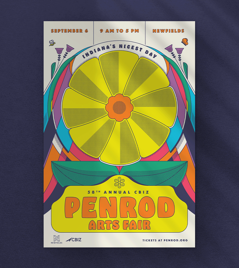
Penrod
58TH Annual Art Fair
Visual Identity
Positioning + Messaging
Brand Activation

A little backstory
Founded in 1967, the Penrod Society is a volunteer group dedicated to supporting the arts in Central Indiana. Known for its annual Penrod Arts Fair, one of the nation’s largest single-day art fairs, the Society raises funds for local cultural and educational programs.
Penrod came to us for help bringing their vision for the 58th annual Art Fair to life. Inspired by the music industry, they imagined a diptych-style design connecting both the Art Fair and Evening with Penrod, an invite only gala the night before.
Drawing from 1960s gig posters, we infused the design with bold energy and Penrod’s signature bright colors. The result was a vibrant day-and-night duo celebrating the spirit of each event.


The Idea
The name “Noesis” stems from platonic philosophy. It was viewed as the highest form of knowledge, something to strive for, an enlightenment. The analogy of dawn paints the picture of Noesis rising, bringing forth enlightened data.
The icon developed as part of the custom wordmark is subtle but makes a clear statement. Reinforcing the theme of enlightenment, much of the identity design is based on gradients found in nature.


The approach was thoughtful and intentional. It clearly aligned our business goals with the needs of the customer.

Jenny Davis
President, Noesis


